NTR IDENTITY
Metal wall and mobile as visual identity for Dutch independent public broadcaster NTR. Mediapark Hilversum, The Netherlands.
How to visualize their story?
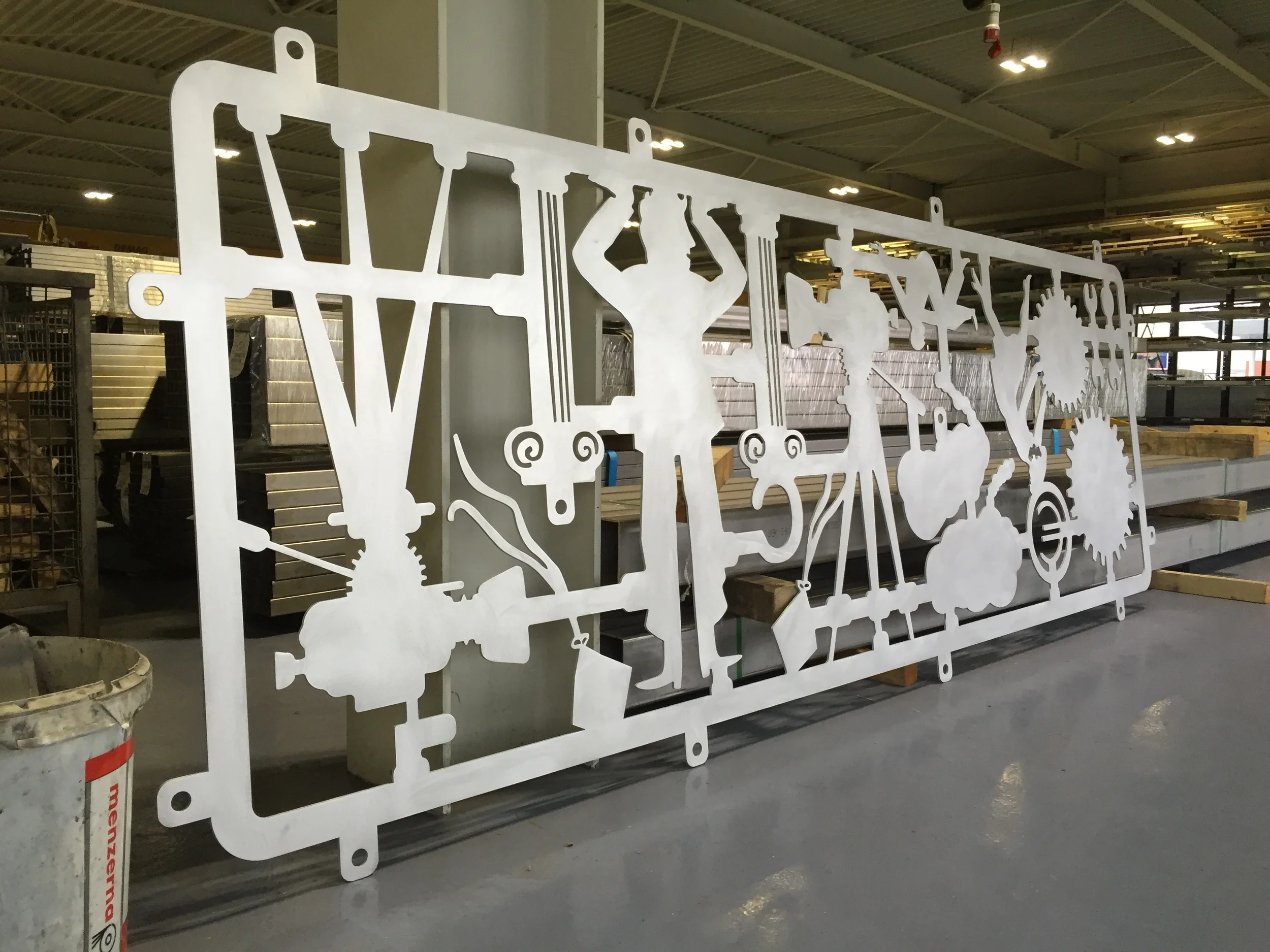
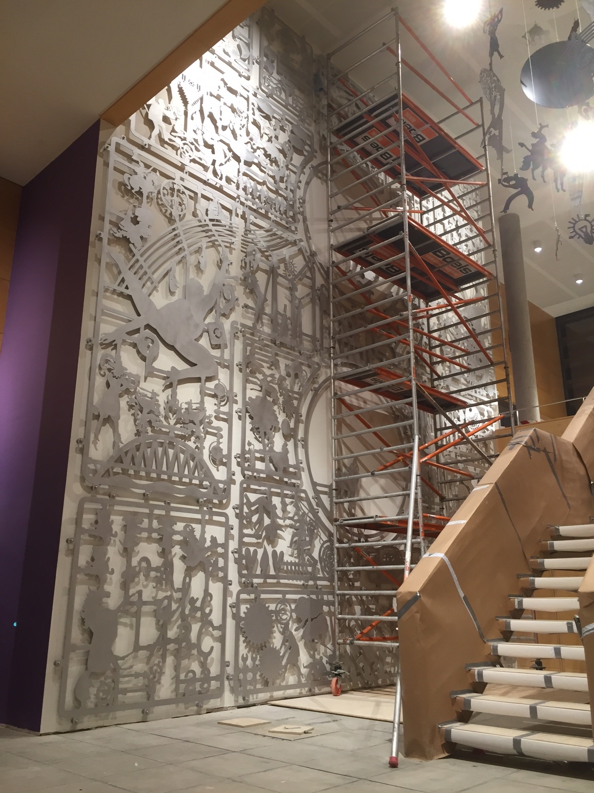
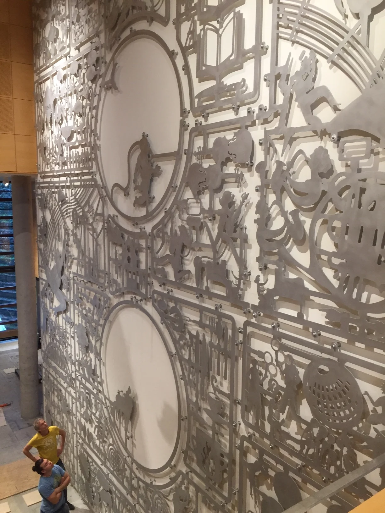
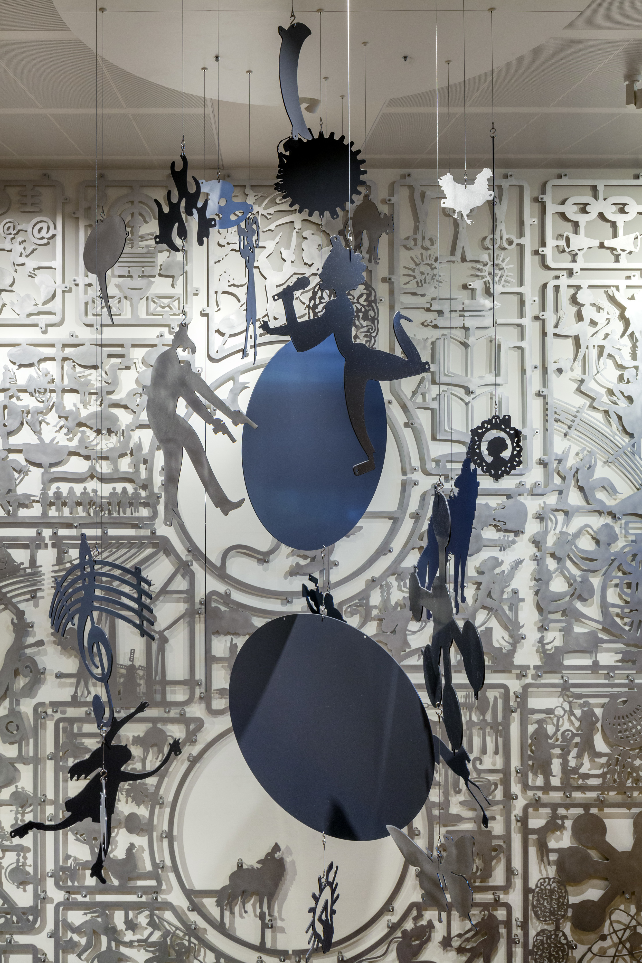
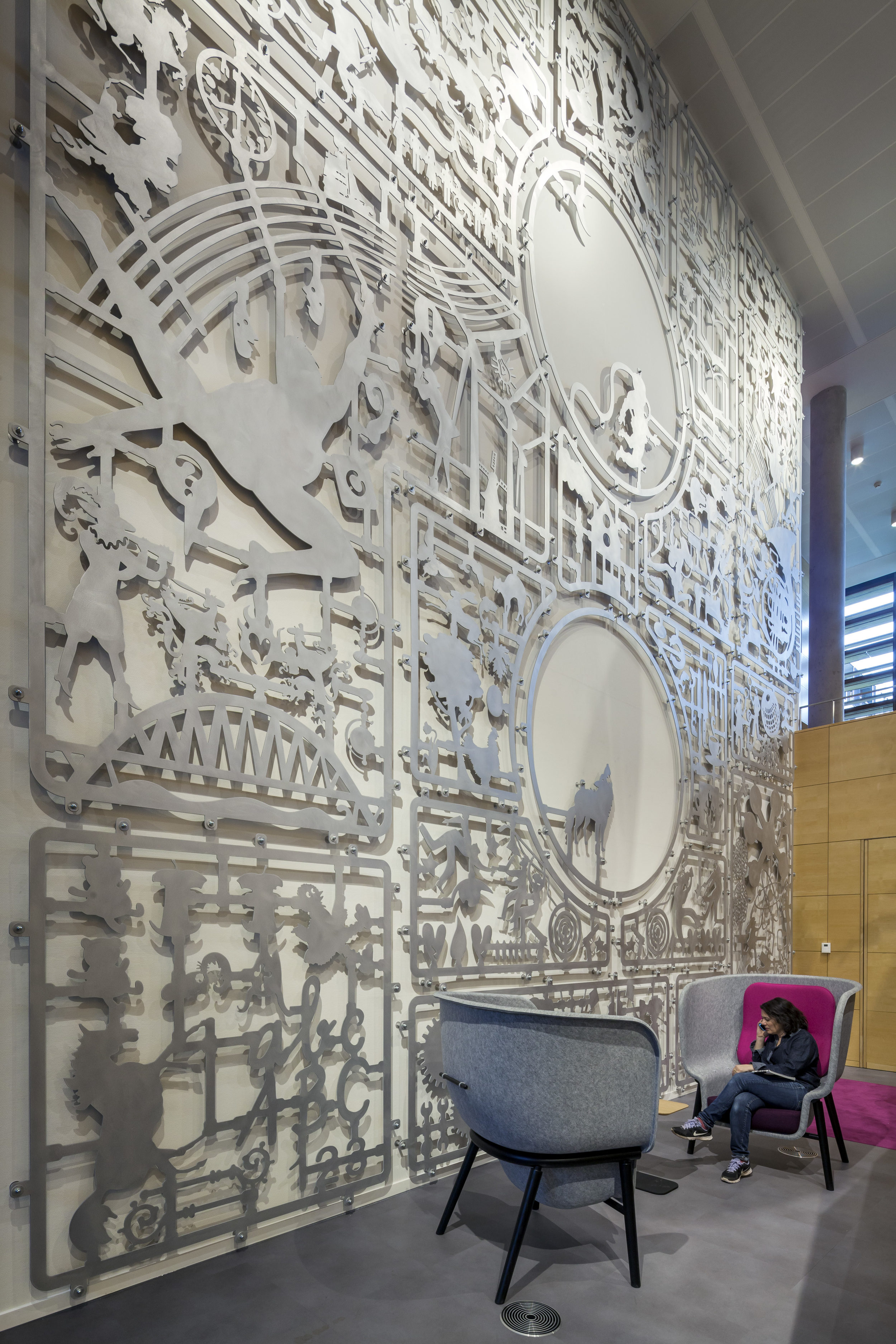
How do you create an identity for an organisation that produces children's programmes like Sesame Street and Het Klokhuis but also broadcasts experimental dance performances? How do you make a visual story based on so many different themes? We found a solution by using the metaphor of a construction board. NTR employs enthusiastic programme makers and creators.
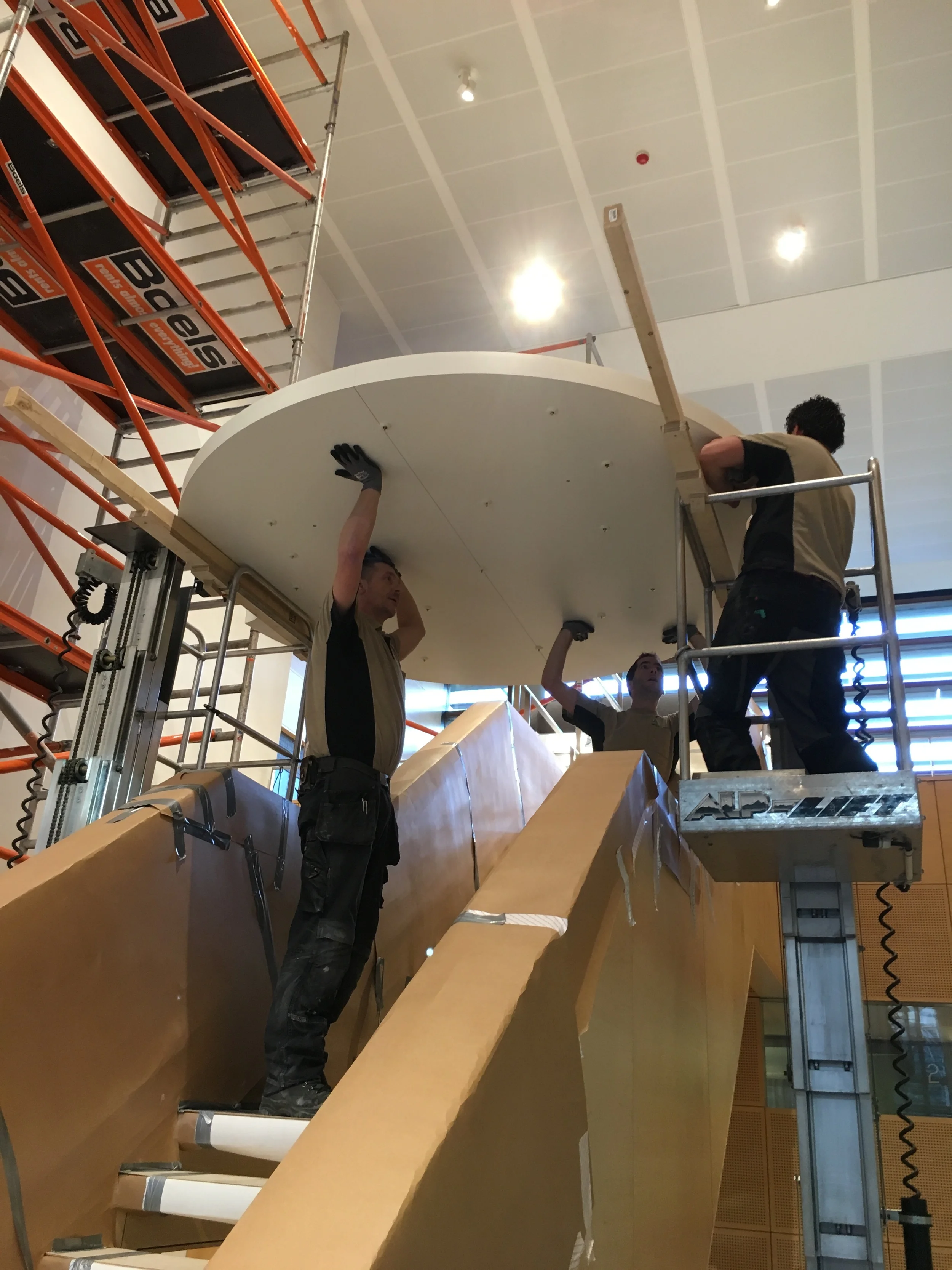
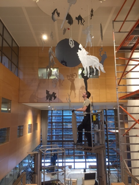
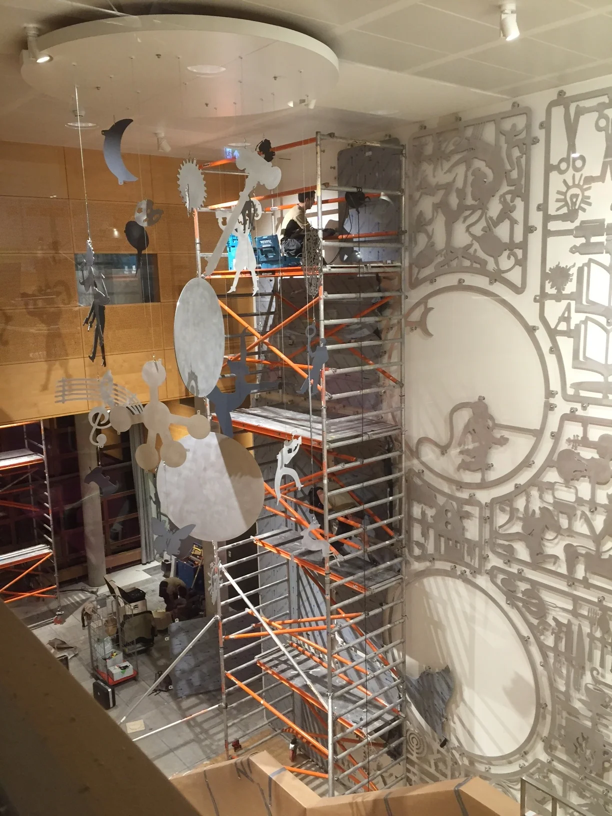
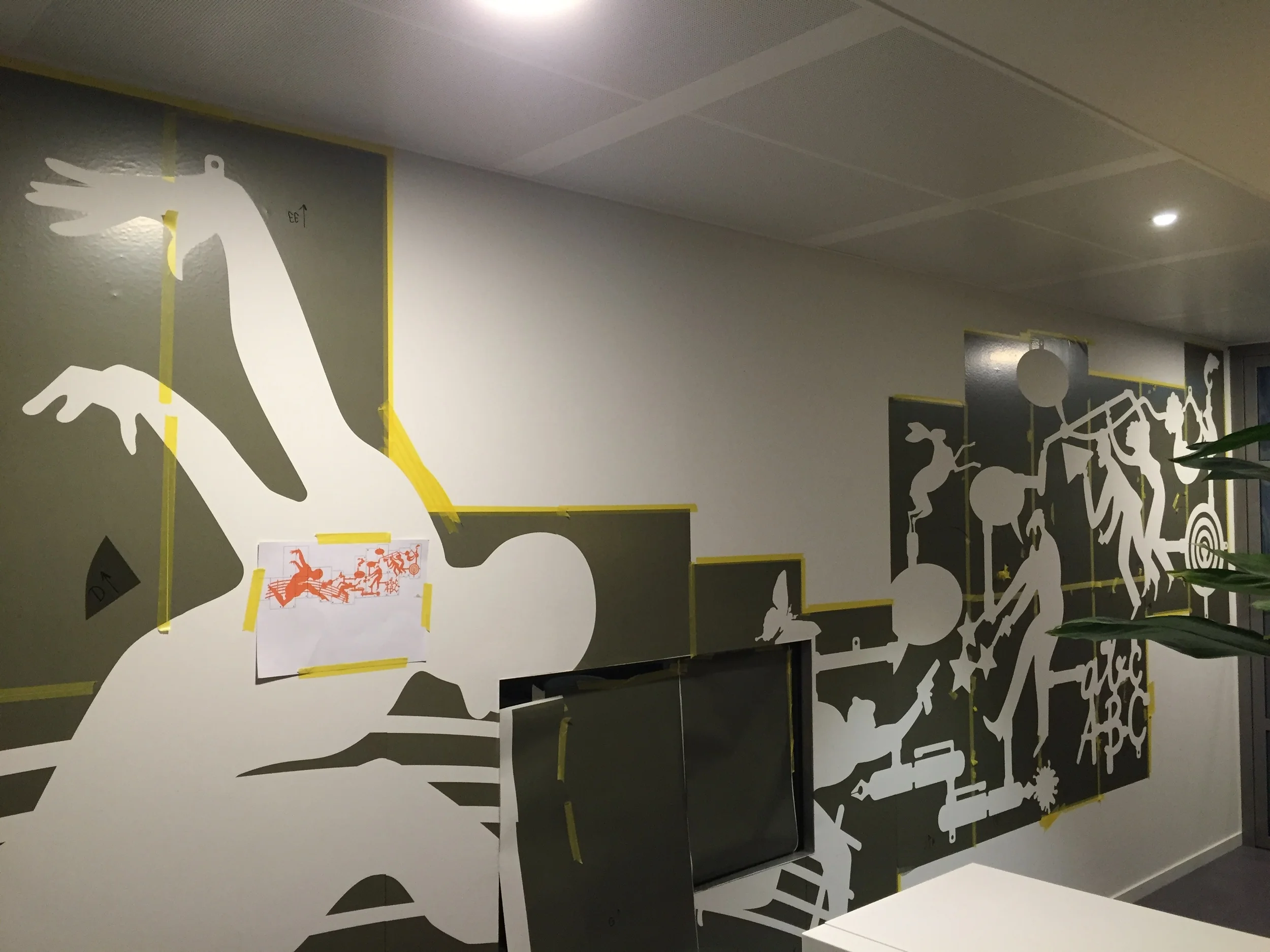
Elements and themes of NTR and its programmes were assembled in a three-dimensional object based on this idea of the construction kit. The main entrance with its huge wall was the right place for this piece. Combinations of individual parts appear (painted directly on the wall) in other parts of the building.
This project has been realised in cooperation with the interior designers of Workshop of Wonders.


[photography by Daria Scagliola]